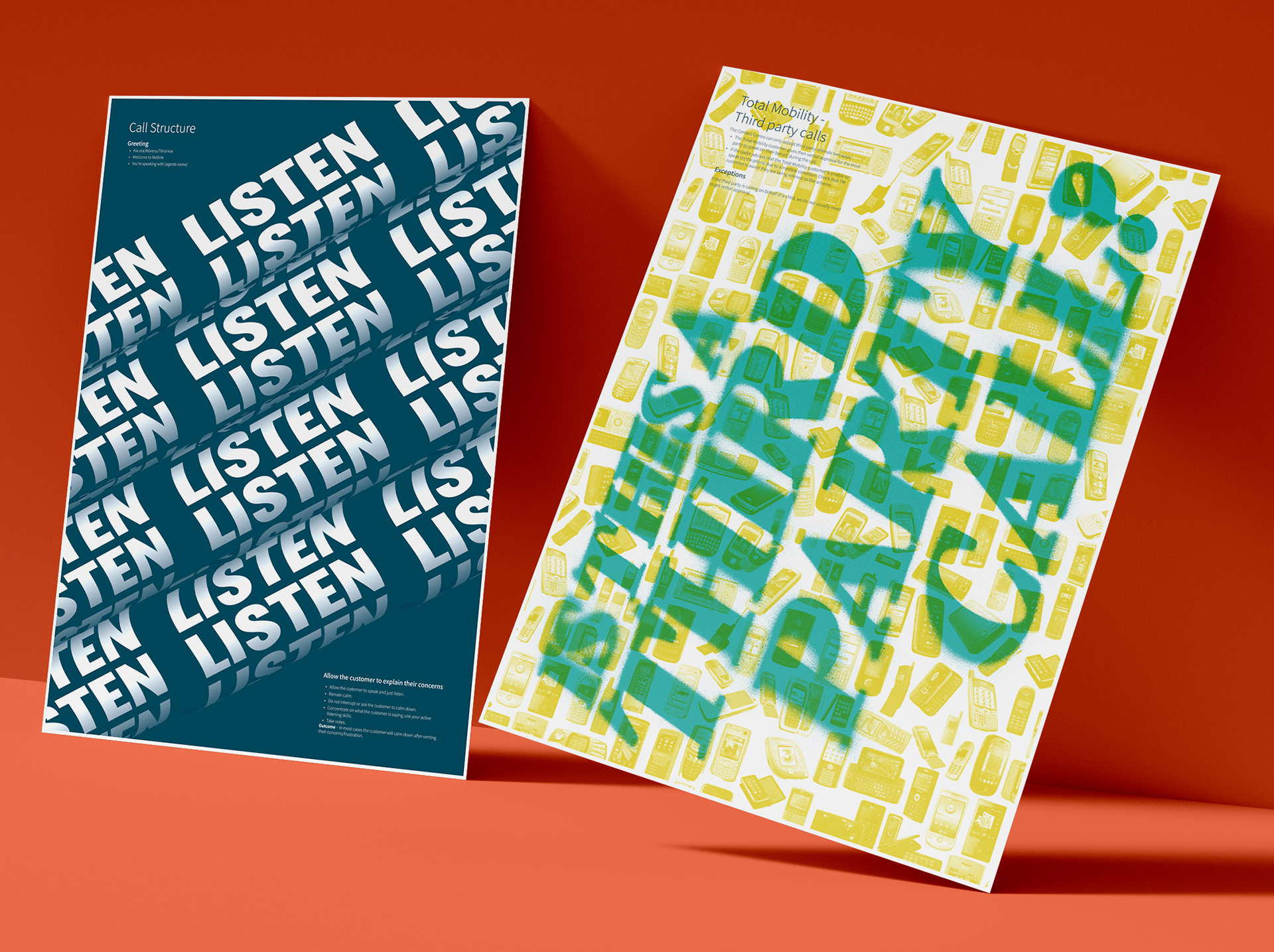
The Greater Wellington Contact Centre needed some way to remind staff of their process when taking calls. Because the team is quite young, we decided that a modern, graphic poster series would be the best solution. This series will expand over time and hopefully reflect the culture of the department.
Each poster has a main phrase or reminder, as well as a small paragraph going into detail about the correct process. It was really important to the team that these felt like cool posters first, and process reminders second. In order to have cut through, we opted for typographic designs, to stand out from other image-heavy internal communications posters.
Because it was an internal project, we were able to go wild with the brand colours without worrying too much about brand recognition, and were able to drop the logo entirely. The posters were printed A0, which meant that even the small text would be legible.